Introduction
Quick start about how to make your WebGL accessible with @react-three/a11y and react-three-fiber

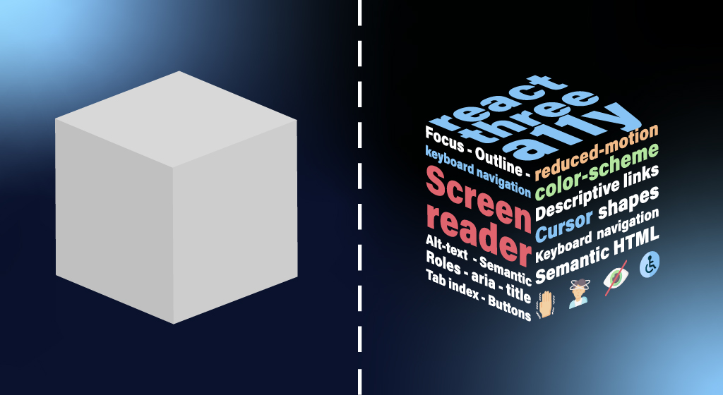
@react-three/a11y brings accessibility to webGL with easy-to-use react-three-fiber components:
- Focus and focus indication
- Tab index and keyboard navigation
- Screen reader support and alt-text
- Roles and cursor shapes
- Descriptive links
You can try a live demo here. Open it with your favourite assistive tech to test it out !
npm install @react-three/a11y
Quick overview to get started
The A11yAnnouncer component
First, place the A11yAnnouncer component next to the R3F Canvas component. This component is critical since it manage some screen-reader features.
import { Canvas } from '@react-three/fiber'
import { A11yAnnouncer } from '@react-three/a11y'

function App() {
  return (
    <>
      <Canvas />
      <A11yAnnouncer />
    </>
  )
}
Then wrap components you want to make accessible with the A11y component
To add accessibility features to your scene you'll have to wrap components you want to make focusable with the A11y component:
import { A11y } from '@react-three/a11y'
[...]
<A11y>
  <MyComponent />
</A11y>
MyComponent can now receive focus. More accurately, the emulated "focus" will be handled at the A11y components which acts as a provider
for children to access its state. But even if objects are focusable, nothing will be displayed or shown by default.
Call function on focus
The focusCall prop of A11y will be called each time this component receives focus (usually through tab navigation).
<A11y role="content" focusCall={()=> console.log("in focus")} ... />
Call function on click / keyboard Click
The actionCall prop of A11y will be called each time this component gets clicked, focused, keyboard activated etc.
<A11y role="button" actionCall={()=> console.log("clicked")} ... />
Provide a description of the currently focused / hovered element
When using the description prop in combination with the role prop, the A11y component will provide a description to the screen reader users on focus/hover.
Optionally, you can also show the description to the user on hover by setting showAltText={true}.
// Reads "A rotating red square" to screen readers on focus / hover while also showing it on mouseover
<A11y role="content" description="A rotating red square" showAltText ... />
// Reads "Button, open menu + (description on how to activate depending on the screen reader)" to screen readers on focus / hover
<A11y role="button" description="open menu" actionCall={()=>{someFunction()}} ... />
The four roles of the A11y component
Like in HTML, you can focus different kind of elements and expect different things depending on what you're focusing.
Content
<A11y role="content" ... />
Uses the default cursor. This role is meant to provide information to screen readers or to serve as a step for a user to navigate your site using Tab for instance. It's not meant to trigger anything on click or to be activable with the Keyboard. Therefore it won't show a pointer cursor on hover.
Button
<A11y
  role="button"
  description="Send email"
  activationMsg="Sending email" ... />
Uses the pointer cursor. Special attributes: activationMsg.
This role is meant to emulate the behaviour of a button or a toggleable button. It will display a cursor pointer when your cursor is over the linked 3D object. It will call a function on click but also on any kind of action that would trigger a focused button (Enter, Double-Tap, ...). It is also actionable by user using a screen reader.
ToggleButton
By using the role togglebutton, you'll emulate a button with two state that will have the aria-pressed attribute.
You'll then be able to use the deactivationMsg property in addition to the usual description and activationMsg properties.
<A11y
  role="togglebutton"
  description="Dark theme "
  activationMsg="Switched to dark theme"
  deactivationMsg="Switched to light theme" ... />
Special attributes: deactivationMsg
Read more about role ToggleButton
Link
<A11y role="link" href="https://url.com" ... />
Uses the pointer cursor. Special attributes: href.
This role is meant to emulate the behaviour of a regular html link. It should be used in combination with something that will trigger navigation on click.
Screen Reader Support
In order to provide informations to screen reader users and use this package at its full potential, fill the description prop of all your A11y components and use the appropriate role prop on each of them.
Use of section
For screen readers, it might be useful to provide additional information on how to use some unconventional UI. You can do it by wrapping the concerned part of your code relative to this UI in the A11ySection like so.
<A11ySection
  label="Shape carousel"
  description="This carousel contains 5 shapes. Use the Previous and Next buttons to cycle through all the shapes."
>
  [...]
</A11ySection>
Access user preferences
The A11yUserPreferences component is available in order to access user preferences such as
- prefers-reduced-motion
- prefers-color-scheme
Take a look at the A11yUserPreferences page or the demo to see it in action and how to use it. The demo will adapt to your system preferences.
Additional Features
Use a custom tabindex with for your A11y components by providing a number to the tabIndex attribute
<A11y tabIndex={-1} ... />
Avoid using tabindex values greater than 0. Doing so makes it difficult for people who rely on assistive technology to navigate and operate page content. Instead, write the document with the elements in a logical sequence.
More about the use of tabIndex on developer.mozilla.org